
Designed by Konrad F. Bauer and Walter Baum, Impressum was released by the Bauer foundry in 1962. This text type could almost be called a legibility type because it is readable at small sizes: the letters are wide and open…

Impressum® Font Styles
Tags
1800s , 1960s , business text , clarendon , egyptian , elegant , formal , german , high x-height , legible , neutral , news , news text , newspaper , realist , Scotch , sensible , serif , slab serif , small sizes , static , text , valuable
Languages
Typographies
Styles
-

1Reznik™ Font
-
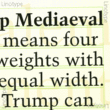
2Trump Mediaeval Office™ Font
-
3KG This Is Not Goodbye Font
-
4Veritas™ Font
-
5Lil Rhino™ Font
-
6WTC Goudy Font
-
7Quimera Font
-
8Timeless Font
-
9Bodoni Serial™ Font
-
10Etiquette™ Font
-
11VAG Rounded™ Font
-
12Decomputer Font
-
13TS Bernstein™ Font
-
14Victorina Black Shadow Font
-
15Autocrat Font
-
16Fouras Font
-
17LTC Garamont™ Font
-
18ITC Mendoza Roman® Font
-
19Versailles™ Font
-
20Postal JNL Font


-
1Bickham Script Pro® Font
-
2Cascade® Font
-
3Rusticana™ Font
-
4Present® Font
-
5Adobe Wood Type Ornaments® Font
-
6Spring LP™ Font
-
7Pompeijana™ Font
-
8Folio® Font
-

9Universal NewsCom+GreekMath Font
-
10Stencil Font
-
11Romic™ Font
-
12Poetica® Font
-
13Ponderosa™ Font
-
14Immi 505® Font
-
15Revue™ Font
-

16Kuenstler Script® Font
-
17Blackoak® Font
-
18Neue Hammer Unziale™ Font
-
19Studz® Font
-
20Sho™ Font


