Foro was designed in 2012 to be a slab serif with an appealing flow, warm, and less harsh than many slab serifs. It evinces an attachment to humanistic shapes, models and proportions. Foro’s demonstrated strength renders it…

Foro Font Styles

Tags
Caecilia alternative , COMPASS-SLAB , editorial , humanistic , Linear Slab , slab serif , true italics , workhorse
Languages
Typographies
-

1Targo 4F Font
-
2Nudista Font
-
3Oksana Cyrillic Font
-
4Wyoming Pastad™ Font
-
5Syondola™ Font
-
6Goldbarre Font
-
7Combat Tested BTN Font
-
8Biza Font
-
9Regime™ Font
-
10Respublika FY Font
-
11Work Force JNL Font
-
12Stanix™ Font
-
13OL Grecian Modern Font
-
14Aviano Slab™ Font
-
15Deutsche Poster Font
-
16ITC Usherwood® Font
-
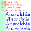
17Anarckhie™ Font
-
18Classico Font
-
19Gauthier FY Font
-
20Bigboy Font