Mark van Bronkhorst’s MVB Magnesium is based on his impressions of a style of lettering often seen on early 20th century hand-painted signage. With its thick-thin strokes and angled terminals, MVB Magnesium is a…

MVB Magnesium® Font Styles
Tags
1940s , 1950s , 1960s , American , Art Deco , block , caps only , clean , commercial , computer , conservative , constructed , corporate , decorative , fashionable , flair , formal , futuristic , geometric , grotesk , headline , headlines , heavy , idiosyncratic , impact , information , legible , letterhead , lettering , linear , logo , macho , magazine , masculine , masthead , menus , minimal , modern , modest , movie , movie credits , music , neutral , Thick & Thin
Languages
Typographies
Styles
-

1Theodoric Font
-
2Custard Font
-
3Deutsche Poster Font
-
4Pax #2™ Font
-
5Monoron Serif™ Font
-
6Mortised Ornaments Font
-
7Wetetque™ Font
-
8Lucida Sans EF™ Font
-
9OL Egiziano Comstock Font
-
10Monoment Font
-
11Nina Font
-
12Ornaments 6 AR Font
-
13Leitura Font
-
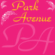
14Park Avenue® Font
-
15Alphabet Soup Font
-
16Tailor™ Font
-

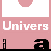
17Univers® Font
-
18Spiroglyph Font
-
19Etho Font
-
20Kaufmann Font