Karben 205 is inspired by the classic, no nonsense DIN, and has a form that follows its highly legible function. Based on a lozenge, it has a clean and pure geometry with even stroke weights. Karben 205 is characterised by…

Karben 205 Font Styles
Tags
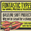
clean , compressed , condensed , DIN , display , functional , geometric , grotesk , headline , heavy , honest , legible , lozenge , machine , magazine , mechanical , Meta , metro , modern , Modernism , narrow , Neuzeit , poster , round , sans , sans-serif , signage , simple , strong , tall , technical , technology , urban , utilitarian
Languages
Typographies
Styles
-

1Mere Font
-
2Besley Clarendon Font
-
3Merrivaux™ Font
-
4Whiteboard Modern Font
-
5Kadeworth Font
-
6Kolly Font
-
7Vanyla 4F Font
-
8Gravel Font
-
9Elida JNL Font
-
10Oksana Sans Condensed™ Font
-
11PC Gothic™ Font
-
12KG Somebody That I Used To Know Font
-
13Cruz Cantera™ Font
-
14Eurobrush Pro™ Font
-
15Cold Case JNL Font
-
16Spiderlegs Font
-
17ITC Esprit® Font
-
18Idiom Font
-
19OL Hebrew Prismatic Font
-
20Spaced Out™ Font