The Ko-family was developed for the text posters at the Holland Festival in 1997, based on the filling of a lettering stencil with different pen thicknesses. The Ko-Heavy and the Ko-KAP were the first weights; the family was…

Ko Font Styles
Tags
Languages
Typographies
Styles
-

1Stencil Set JNL Font
-
2Nashville EF™ Font
-
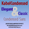
3Kabel DT Condensed Font
-
4Oksana Sans Condensed™ Font
-
5Isometrik™ Font
-
6Mixed Breed Font
-
7Folio® B EF Font
-
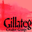
8Gillateg Font
-
9Respublika FY Font
-
10MVB Magnesium® Font
-
11Minerva Font
-
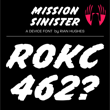
12Mission Sinister Font
-
13ITC Malstock™ Font
-
14Party Noid Font
-
15Centim™ Font
-
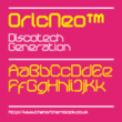
16OricNeo™ Font
-
17Impact™ Font
-
18Stencil Extras JNL Font
-
19Long Underwear Font
-
20Japanese Brush Master Font