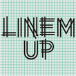
Linem Up JNL is based on one of Alf R. Becker’s alphabets for Signs of the Times magazine. With A-Z only and basic punctuation, it is best used in very limited text at larger point sizes. Thanks to Tod Swormstedt of ST…

Linem Up JNL Font Styles
Tags
Languages
Typographies
-

1Vertrina Font
-
2Tribal Council JNL Font
-
3Huxley Vertical Font
-
4Impregnable Font
-
5Kycka Font
-
6Grammatik™ Font
-
7Quantico Font
-
8Sundance™ Font
-
9Pickfair JNL Font
-
10Phantom Font
-
11Merrivaux™ Font
-
12Margate JNL Font
-
13Polytype Optyx Font
-
14Seaside™ Font
-
15Rivoli Initials™ Font
-
16Directory Board JNL Font
-
17Sonica Brush Font
-
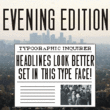
18Evening Edition JNL Font
-
19Stencil Machine JNL Font
-
20Consort™ Font


-
1Narrow Stencil JNL Font
-
2DuBois JNL Font
-
3Sporting Chance JNL Font
-
4Gramercy Eight JNL Font
-
5Quirkley JNL Font
-
6Chinese Herbs JNL Font
-
7Socialite JNL Font
-
8Flivver JNL Font
-
9Window Dressing JNL Font
-
10Sign Designer JNL Font
-
11Oblogram JNL Font
-
12Roma Initial Caps JNL Font
-
13Public Works JNL Font
-
14Sign Crafters JNL Font
-
15Nighthawk JNL Font
-
16Lamp Post JNL Font
-
17Toucan Tango JNL Font
-
18Thin Mint JNL Font
-
19Rookie JNL Font
-
20Shipping Carton JNL Font