
This idea of ”wrong way weights” was originally called French Clarendon by the Americans, Italienne by the French, and American by the Italians. Sounds like nobody wanted to own up to it. When it was revived by…

Dime Museum Font Styles
Tags
Languages
Typographies
Styles
-

1ITC Spirit™ Font
-
2ALT Apollo13™ Font
-
3Polytype Dumas I Frames Font
-
4FG April Font
-
5Advance™ Font
-
6EF PLA.card™ Font
-
7AF Generation ZaZ Font
-
8Brookhurst JNL Font
-
9Bond 4F Font
-
10Ysadora Font
-
11Mister Earl Font
-
12Cloister™ Font
-
13Okrana Font
-
14Gnomad Font
-
15Ikewund Font
-
16Brigidis Font
-
17Zaragoza™ Font
-
18Whimsy™ Font
-
19Fraktendon Font
-
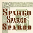
20Spargo Font


-
1Trapeze Font
-
2Minsky Font
-
3Westmore Font
-
4Alfereta Font
-
5Rigney Font
-
6Emperor Font
-
7Behrens Schrift Font
-
8Master Script Font
-
9Bareback Font
-
10Hearst Italic Font
-
11Athena Font
-
12Vienna Font
-
13Arcade Font
-
14Cleopatra Font
-
15Paper Lanterns Font
-
16Dangerfield Font
-
17Cognac Font
-
18Farringdon Font
-
19Berolina Font
-
20Europa Text Font


