Inspired by the Froben capitals believed to have been cut by Peter Schoeffer the Younger, son of Gutenberg’s apprentice, this design is neither strictly a Venetian nor an Aldine. The archaic approach and lack of the Aldine…

Goudy Old Style™ Font Styles
Tags
1910s , 1920s , American , complex , dynamic , elegant , Garalde , informal , Italian , legible , masculine , natural , old-style numerals , Oldstyle , serif , valuable , Venetian
Languages
Typographies
Styles
-

1Wood Factory™ Font
-
2Clarendon® Font
-
3Tenebris Font
-
4Le Monde® Sans Std Font
-
5MVB Emmascript® Font
-
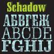
6Schadow Font
-
7Odyssey™ Font
-
8Arte Critique JNL Font
-
9Swiss 911 Font
-
10Giggles BTN Font
-
11Lucida Fax EF™ Font
-
12Bergsland Pro Font
-
13Saturator FA Font
-
14Freestyle Script™ Font
-
15ITC Benguiat Gothic™ Font
-
16Cyrillic Latino™ Font
-
17ITC Goudy Sans® Font
-
18Schwung Font
-
19Humanist 777 Font
-
20Univers® Font


-
1Davida™ Font
-
2Letter Gothic 12 Pitch Font
-
3Bell Gothic Font
-
4French 111 Font
-
5Tannarin™ Font
-
6Century Oldstyle™ Font
-
7Huxley Vertical Font
-
8Life® Font
-
9ITC Gorilla Font
-
10Umbra Font
-
11Nuptial Font
-
12Goudy Handtooled™ Font
-
13Fat Albert BT™ Font
-
14Transitional 511 Font
-
15Playbill™ Font
-
16Balloon™ Font
-
17Murray Hill™ Font
-
18Della Robbia™ Font
-
19Bauer Bodoni™ Font
-
20Piranesi™ Font